Enjoy
Blog
Contents
On playing the tourist (Part 1)
March 26 2015, by Louise Rutledge
Over my last two trips to Auckland I have established a very exhausting routine of trying to visit every gallery I can, all in the one or two days, from the shiny dealer galleries to new artist run initiatives and established community spaces.
In an effort to keep this short and sweet, here are my highlights:
Mark Adams, Nine Fathoms Passage, Two Rooms
It was hard not to be enamoured by the 11 panel, 11 metre panorama that takes centre stage in this exhibition (Adams’ largest work to date). The photograph was taken from a point in Dusky Sound where the artist William Hodges, painter and documenter to Captain James Cook, recorded this and other such landscapes in a way that would affect how Europe formed its view of New Zealand and its people. These panels convey a view of our country both familiar and unknown. They are images reminiscent of a ‘Clean Green New Zealand’, romanticised, dark, and uncharted waters or perhaps an establishing shot for our next blockbuster film. Somehow, I found these images far from idealised, as the depth of both the landscape and the history of the site were reflected in the inconsistencies between the panels: the changes in atmosphere, the different ripples across the surface of the water, reflections of the hills within some images and not others. I couldn’t help but think of (and now name-drop) our recent exhibition Homewardbounder by Caroline McQuarrie, as both artists suggest the power of conventional landscape photography to subvert the viewer’s perception of the landscape, to introduce (or re-introduce) histories of contention and alternate views within their works.

Nicola Verdon, Apparel, Rockies
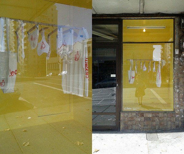
Founded in June last year, Rockies is the latest artist run venture from the people who brought us PLAZA and Ferrari. The gallery/store front window sits right on K – Road and, fun fact, is part of the building that once housed Teststrip (one of NZ's iconic artist run spaces) LINK: http://stella.net.nz/text-by/testing-ground-artist-run-spaces-in-new-zealand/. Their apparel show from recent Elam Graduate and co-founder of the space Nicola Verdon, is an exercise in branding and promotion that extends design into merchandise, into art, into online Facebook store. Featuring a rack of pristine white underwear, socks, cap, top and tote bag, the line up of covetable items made me consider what is takes to makes an artist run initiative successful: is it enough to have great design, branding and promotion, a strong sense of self image, and the hype of being in fashion? While the work makes reference to this, I hope there is more at play than just art-as-promotion, as promotion-as-art makes for a far more interesting conversation. By their own admission, Rockies is [just] “Another Artist Run Initiative”, a seemingly ironic self-awareness that works well with their logo and its riff of the hype that is the ‘emjoi’. Also worth noting perfectly the yellow backdrop matched the Dick Smith down the road.
(Plus, nearby and new to the Auckland artist run scene: Glovebox)

Billy Apple, ACDC, as part of Totems, Starkwhite
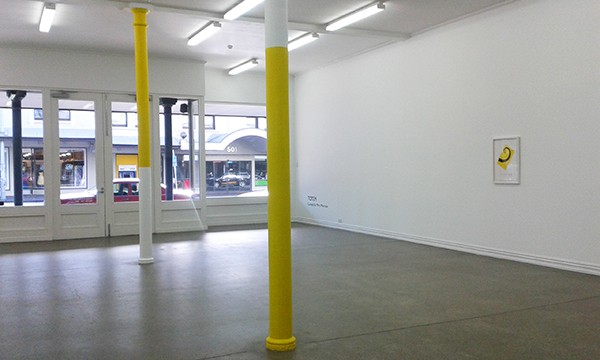
As the first Billy Apple show I encountered in Auckland, it was a great taster ahead of the full oeuvre. The two centre pillars of the main gallery had both been partially painted yellow, a visual decoding of dealer gallery transactions, representing the Artist Cut Dealers Cut. After later seeing the documentation of similar interventions in his much talked about Auckland Art Gallery retrospective (AAG is worth visiting just to see Lisa Rehanna’s phenomenal multi-screen video work In Pursuit of Venus [infected]), like anything, this work is most successful in situ, in direct dialogue with the very systems it is flirting with.

Martha Rosler, Vogue, as part of Imaginary Audience Scale, Artspace
The second iteration of Poetry in Motion, following on from Billy Apple’s SUCK, Imaginary Audience Scale brought a whole new set of works into the gallery. Outlined as a ‘skeptical approach to exhibition making’, I wish I could have visited the show more often and seen how the exhibition unfolded. Their new director Misal Adnan Yildiz has placed a greater emphasis on research and development within Artspace, and this notion comes through in the investment and time demanded by each work included in this show. Shifting the format of the exhibition past presenting a definitive, summative moment or finished project, towards a framework for discussion and experimentation, the works in the exhibition were contextualised around the development and presence of the audience.
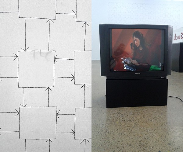
Stephen Willat’s wall drawing, Homeostat Drawing No 1, (1969), was one of the largest works in the show. I was most interested in the smudged ‘TLC’s breaking across the thin pencil lines. A fellow gallery-goer commented to me that maybe they had been rubbed on by a visitor, just the sort of rogue intervention that would fit in comfortably amongst some the challenges this exhibition presented. For me, having been born in the 90s, the TLC can only be a reference to that pop girl group or the phrase ‘tender loving care’, an off topic sentiment but in light of the exhibition’s commentary on audience, a comforting phrase.
If I had to pick a favourite work, I would have to go with Martha Rosler: Martha Rosler Reads Vogue: Wishing Dreaming, Winning, Spending (with Paper Tiger Television) (1982). Through her meditative and lyrical prose Rosler asks and answers, almost chanting, “What is Vogue? Vogue is fashion, it is glamour, it is sex….” “It’s threat and the whiff of decadence.” “It is the allure of narcissism” “It is the new face over the old face.” “It is the weak face covered over by the strong face.”, all the while flicking through the glossy pages, her hands lingering across the bodies of models, highlighting the unattainable, and societies longing for it. It’s the dark side of desire and the stories Vogue would be unlikely to tell, a mantra that’s relevance has not been lost across the 30 years since it was first broadcast.
“What is vogue? It is luxury, it is allure, mystery, romance, excitement, love, splendour, it is fashion, it is clothes, exercise, diet, accessories, it is loving and losing, loving and winning, it is career, it is travel, it is knowing how and knowing who and knowing when..”
For more details on the show, see The Imaginary Audience Scale Reader
#ReadWithArtspace
Steve Carr, The Science of Ecstasy and Immortality, Michale Lett
Teaming up with architect Nat Cheshire to transform Michael Lett into a hessian clubhouse, the latest video works from Steve Carr are an exercise in absurd suspense. Watching two pairs of hands methodically stretch rubber bands around a watermelon has never been more entertaining. The longer you watch, the more is revealed: the seductive red of the girls finger nails, their hands getting more nervous as the bands grown thicker, a crack in the watermelon that slowly starts to leak. I stayed to watch all 33 mins, a ‘once you start you can't stop’ scenario, and have never felt so uncomfortable/bewildered/intrigued by something so ridiculous. (The end is so worth the wait)

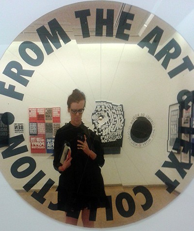
Obligatory #BillyAppleselfie
And in light of distracted reading and the overload of hyperlinks in this blog post, I’ll end with a suggestion to add Matilda Fraser’s Against Efficiency and other texts to your reading list.
