Exhibition Essays
Tangential Structures
May 2013
Reading Sordid Space: Modern Convenience Stores and Tangential Structures.
Julia Lomas
In the spaces of everyday commerce, objects crowd each other. Spaces such as the modern pharmacy or convenience store, marked by the ubiquitous and mundane attributes that make such environments so aggravatingly commonplace, are tightly packed with shower sponges and bath bombs, vitamins, razors and prophylactics, various creams, beauty and wellness solutions. Signs advertise prescriptions and advice, a free gift with purchase. Similarly, in the supermarket, order is arranged by aisle, and narratives play out in sequence: fresh fruit for vitamins, meat for protein, canned food for schlubs, toilet paper, cleaning products, shampoo: in short, the detritus of daily life. Meanwhile, online market places proffer garish banners, bossy taglines, overfriendly avatars, sans-serif fonts, and promises of travel discounts; objects are still ordered by category, but shift wildly in condition and provenance.

In an analysis of these spaces, it is useful to borrow the term ‘deep communication’ in order to discuss to the way a space can implicitly communicate a set of agendas, goals, feelings or states.1 These messages may be simple—consumption—or more opaque. Parallel to the overt dialogues of trade and exchange, other conversations are being held in any given space (be it commercial or otherwise) communicating and affirming ideologies. These intrinsic and intangible sets of beliefs and ideals are more pervasive than simple consumption narratives. Sean Sturm and Stephen Turner’s principle of deep communication refers to the manner by which spatial design principles enforce a certain ‘distribution of the sensible’,2 and here, these most quotidian arenas of contemporary capitalism are useful examples by which to conceive of Yona Lee’s installation as a diagram of space, one that unpacks the distribution of everyday consumption.
The modern convenience store is what I will call here a ‘sordid space’: mid to low grade, objects of dubious quality arrayed unpleasantly, and an experience that is uninspiring and frustrating in its pedestrian nature. It is sordid in the sense that it is, above all, so ordinary. References to the baselines of human existence can be found everywhere—toilet paper, soap, bad food; things that remind us of the indignities of human existence, fabric we know won’t breathe, pies that look soggy. Further instances include the mid-range department store, the upmarket petrol station café, while online examples are found in TradeMe, Gumtree, and Craig’s List.
These spaces are defined by clutter, a visual mish-mosh of objects that traverse the mundane needs of collective existence, all sitting side by side: sports equipment, cheap sunglasses, hardware, knick-knacks. The narratives here would seem to be ones of drudgery—the prosaic business of life that requires the purchase of such items. Within these settings and the daily practice of such rituals, we generally want something uplifting, something that promises the fulfillment of certain needs. These needs are many and insatiable: lunch options, an afternoon pick me up. Painkillers, cigarettes. Chewing gum, embarrassing cravings, gossip magazines. Or they are non-material needs: stimulation, entertainment, or inspiration. Reading these spaces, the convenience store, the pharmacy, chain stores and TradeMe interfaces, these sites share common tendencies in their ad hoc natures, their ordinary-ness, their low ambitions.
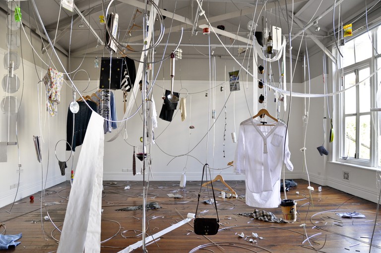
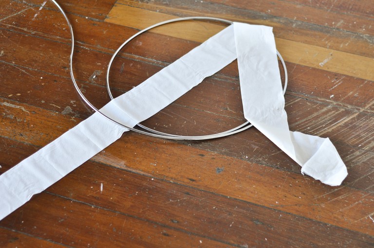
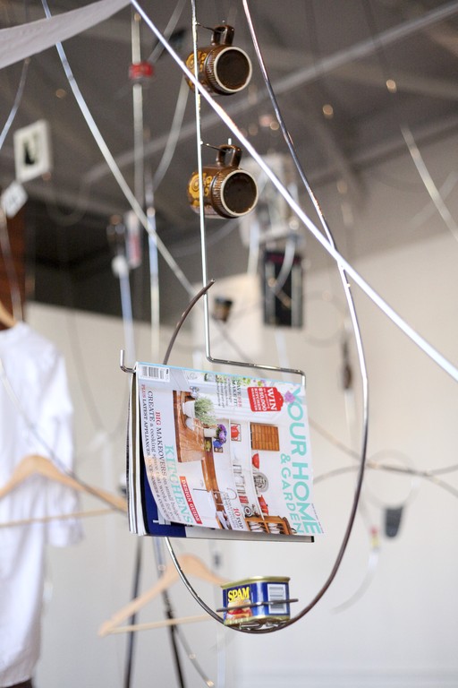
Tangential structures presents a corrupted, broken, haywire space. The cold gleam of chrome-plated steel in fluid, sinuous cord-like forms refracts and tangles the gallery. Slung over these steel ropes are towels and toilet paper, while other structures incorporate display units for sunglasses and magazines, a pot plant and coffee cup. Multiple languages of display have become tangled, like the mythic stroke victim who suddenly breaks out in fluid French without knowing why or how. The gallery itself feels overcrowded and dirty by its association to damp towels, half drained wine glasses, canned food, and ashtrays. Meanwhile, the gallery’s own products have become integrated and implicated in this mess—books from the reading room hang ludicrously in custom display units, like drunk teenagers showing off at their Dad’s 60th. The installation confounds its visitors.

If we think of an exhibition as “information design”, Lee is communicating a state of distraction. The steel structures act as an extended diagrammatic display of confusion, a glossolalia of speech patterns ranging across the mundane spaces of contemporary commerce. This is the muddling, divergent chatter of the marketplace, of mental shopping lists that get obliterated in the excessive universe of the supermarket, or the puzzling interior of the inner city convenience store. Lee has eschewed both transcendent goals and prescriptive ones; an account of her project must examine what kinds of spaces are being contested, before it asks what environment has been created. By noting the qualities and conditions of generic spaces (a pharmacy, a Farmers Store branch, a gallery), Lee’s project deconstructs the structures and architectures of these sites.
What is communicated within the tawdry, slightly undignified ‘sordid space’? Compare the experience contained in a Warehouse or StrawberryNet.com, as opposed to the sleek and slick spheres of global capital and high commerce, the type of transcendent experience communicated within the flagship building of a major conglomerate, and indeed, within the contemporary gallery. The project embodied within Tangential Structures complicates and applies pressure to a particular dialect, one that sits within the international languages of design and display. This language is one we don’t even realize we speak fluently until we see it so confused, and this realization brings certain deep currents to the surface.

-
1.
This term is borrowed from Sean Sturm and Stephen Turner’s “Knowledge waves: New Zealand as educational enterprise.” Sean Sturm and Stephen Turner, 163, accessed April 25, 2013, http://seansturm.wordpress.com.
-
2.
Sturm and Turner here make use of Jacques Ranciere’s “‘apportionment of parts and positions . . . based on a distribution of spaces, times, and forms of activity”. Rancière, J. (2004). The Politics Of Aesthetics: The Distribution of the Sensible (G. Rockhill, Trans.). London, England: Continuum, quoted in Sturm and Turner, 2012.
