Exhibition Essays
Enjoy Gallery Catalogue 2005
December 2005
-
Introduction
Jessica Reid -
Hunt
Michael Havell -
The Bomb
Sarah Miller -
Soliloquy
Amy Howden-Chapman -
Untitled (Pictures, Objects, Enjoy, Cuba St, Wellington, 2005)
Melanie Hogg -
Notes on Grand Narratives
Daniel du Bern, Simon Denny, Tahi Moore -
Ideas for banners for The End of Water
Jessica Reid -
HUMDRUM
Thomasin Sleigh -
Playing Favourites
Jessica Reid -
Everything I Know at the Top I Learned At The Bottom
Jessica Reid -
Michael Morley
Louise Menzies -
Soft Serve
Kate Wanwimolruk -
Repeat Performance 2005
Jessica Reid -
Schlock! Horror!
Jessica Reid -
Special At Enjoy. First Year Show
Jessica Reid -
Spellbound
Pippa Sanderson -
At Home (In Transit)
Jessica Reid
Schlock! Horror!
Jessica Reid
A statistic which is frequently quoted, if not completely accurate, is that Wellington now has more cinemas per head of population than anywhere else in the southern hemisphere. Older cinemas have decided to upgrade and renovate, add more screens or move to a new location. The rebirth of the suburban cinema has influenced this trend and pushed the goal towards quality over quantity. Now catering to a mature, baby-boomer market, this means good coffee, matching décor, spacious armchairs or even couch seating and paninis and gelato in place of popcorn. For Mike Heynes, creator of Schlock! Horror! this signals the end of a golden era, of a style of filmmaking itself as much as the film viewing experience. Heynes’ work mourns the end of the lowbrow, cheap, easily digestible films he remembers from his childhood and in particular films of the horror genre. Animator Heynes claims that it is Peter Jackson’s Bad Taste (1988), which is the director’s greatest achievement. Bad Taste was reportedly made solely in the weekends over a period of five years, the director teaching himself filmmaking by reading magazines. No major international backers were required for this Jackson film, and Heynes believes it is all the better for that fact.
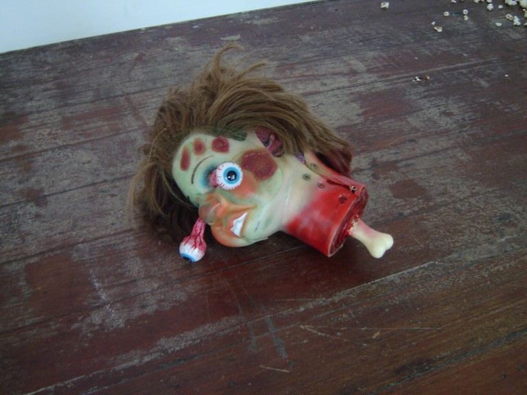
Schlock! Horror! replicated the sad and tired warehouse of a film production company gone bust. One wall was covered in a beige, seventies design wallpaper, props and costumes strewn on the floor. The exhibition combined film props, miniature diorama sets, end-of-line faux- merchandise and looping trailers for nonexistent films. To make a point of the lack of computer- generated trickery, Heynes displayed the props used in the shorts alongside his film projection. On closer inspection of some of these props, it became clear that Heynes has become adept at using whatever materials he has at hand. The work ‘Ugly Dog’ managed to be unsettling, wavering between humourous and grotesque, despite the fact it didn’t hide the method of its construction. Among the materials used, one can spot wool and human hair, paint, glue, a water balloon, plastic fangs and dolls’ hands.

The work immediately brings to mind Patricia Piccinini’s hybrid creatures (minus the slick production), in particular her ‘The Young Family’ (2002/2003). The mother creature of Piccinini’s family has humanoid hand feet, which have a creepiness present in their similarity, not their differences, from our own hands and feet. Similarly, Ugly Dog’s size and shape that recalls a real cat, and its ‘feet’ made from toy doll hands which reference the human body, are what make it so grotesque.
In the corner of the room a small mountain of popcorn was piled high, something which has recently become an anachronistic trope of the film-going experience. It filled the gallery with its stale buttery scent. A disembodied mechanical hand stuck out from the popcorn, desperately groping at the floor or to opportunistically catch a passing visitor by the ankle. The mechanical hand, true to the shoestring ethos of the exhibition, worked only sporadically, lying dead for hours until briefly rearing into action again.
Continuing in the theme of bygone film going practices, a stack of cardboard 3D glasses was arranged on the window sill. These anaglyph red and blue spectacles are a leftover of cinema’s golden era of 3D films in the nineteen fifties, which was also briefly revived in the late sixties. 3D films, a marketing gimmick which attempted to compete with television’s increasing popularity as an entertainment form, were plagued with problems. The films frequently sacrificed engaging narratives in order to stick to the technical requirements of their production, which were often unconvincing in their results. In Schlock! Horror!, however, Heynes reveled in the gimmick’s downfalls. The slightly off-register blue and red shadow effect of one of the film trailers was reminiscent of the old 3D films, even starting with the traditional instruction on screen to ‘Please now put on your glasses’.
A rollicking soundtrack accompanied the trailers with music played by local bands and musicians: The Garden of Timeless Wonder, Friendly Barnacle, Dragstrip, John Douglas, Mister Pudding, The Idle Suite, and The Rocking Whores. The screeching, relentless repetitive guitar rhythms reflected Heynes’ irreverent punk attitude towards filmmaking.
So Schlock! Horror! was a swansong for a time gone by, when filmmaking to the young impressionable mind seemed tantalizingly within one’s own capabilities and reach. Schlock! Horror! nostalgically celebrated this time in all its messy, flawed glory.
